
After a hard working day or even a day off with family, the first place everyone likes to be is their own home. From the beginning, the house have been a place of peace and all human beings have always tried to make their places, even the smallest one, beautiful with their color combinations and it’s always been human being’s concern.
For this reason, as time passes, better decorations ideas are proposed for the home arrangement.
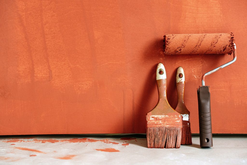
There are many issues involve in the house that make the place beautiful and pleasant, one of them and perhaps it can be boldly said that the most important of them is the combination of colors in the decoration; Because the best and most expensive furniture and the most luxurious appliances in the biggest houses will lose their appearance and beauty completely if they do not have a suitable color combination.
On the other hand, if you are a little familiar with the psychology of colors, you certainly know what miraculous effects colors have on the human psyche and mood. Although the choice of color for home furnishings is a matter of taste and depends on the interests of the person, but following some tips will help to achieve this goal; therefore, in this section, we want to help you choose the best color combination with a few tips.
How to choose the right color for home decoration?
In choosing the color combination for home’s decoration, it is necessary to match the color of the furniture and environment, including flooring, walls, curtains, cabinets and home appliances. In addition, in choosing the color, design of the environment, type of the use, age and gender of the residents and the dimensions of the house should be considered as well.
In the past, we may not have seen the bright colors and happy colors in the layout of the houses, but today we can say there is no limitation for the color combination in decoration, if the selected colors are appropriate. The first thing to consider is to categorize the colors into two main and sub groups and use complementary colors together.
In this division, there are three main colors and the rest of the colors are obtained from the combination of these three primary colors. Yellow, red and blue are the primary colors and other colors such as orange (combination of yellow and red), green (combination of yellow and blue), purple (combination of red and blue) are the secondary colors.
It is enough to know this point.
To be able to put any color next to its additive. Recognizing additive primary colors is also given the secondary colors that come from the primary color combination. In fact, the compliment color consists of the combination of the two other primary colors. For example, the combination of red and yellow, which is orange, is compliment for blue color. Selecting the color is the first step to have a perfect decoration.
The most luxurious appliances with no good color combination will lose their perfection.
Law 10-30-60
In choosing the color by following the rule 10-30-60 is a professional trick to have the best color combination in home decoration. According to this rule, when you choose a color for a place, the colors are divided by this scale
60% of dominant colors, 30% of secondary colors and 10% of tertiary colors
To further explanation, consider a men’s suit, 60% of the total clothing is a suit, 30% is a shirt and 10% is a tie. If we use the same rule to choose the combination of colors, walls and floors 60%, furniture 30%, and minor items such as vases, sculptures, or any other decorative item 10% of the environment color.
Change the dimensions of the house with the right color combination
Yes that’s right! By choosing the right colors, the dimensions of the house can become bigger or smaller.
If you have a small house, it is not recommended to use dark colors in the layout because it makes the environment looks smaller.
The use of soft and light colors such as white, gray, green and light blue makes the environment looks bigger, especially for the background. However, this does not mean that cheering colors cannot be used in decoration, but quite the opposite to show these neutral colors, you must use colorful furniture and accessories.
Choose the background color of the house
Walls and floors are both environment’s background, and choosing good colors help you choose more different colors for the furniture and accessories.
Therefore, it is better to choose a neutral and soft color for them to be easily coordinated with other colors and be set.
These colors are not necessarily white or gray, but using other colors with a light tonality will do the same for you. While the use of bright colors such as red and orange on the walls may be attractive at the first sight, but after a while it will be annoying, but the use of these colors for other items such as furniture in a neutral background will be more prominent.
Neutral and soft colors in the background make the environment look bigger and make other furniture stand out more.
Suitable colors for the bedroom
Roof sandwich panel is a type of sandwich pan. You have variety of colors for the bedroom and you use different colors together according to your interests and tastes, but following some tips in this field will also help you to have a better choice.
The first thing, which should be mentioned, is that the bedroom is a place to relax and should have a relaxing atmosphere. For this purpose, the use of soft and calm colors will be a better option.
Gender and age are also involved in the bedroom. For example, choosing a soft white and pink color for a teenage boy’s room will not be very pleasant. While pink is the favorite color of most girls. Boys also prefer sharp colors like red, blue and orange.
the color combination of young couples, it should be said that despite the popularity of brown color in choosing a bedroom set, decorating the room with white color, different tones of purple , especially lilac, and their combination, add to its beauty, create a pleasant atmosphere and help to sleep more comfortable.
Do not forget the combination of pink and white. The combination of these two colors create a romantic and beautiful atmosphere and is more compatible with women.
Suitable colors for the living room
The living room is the first part of the house that is exposed and is often used more than other parts of the house; That is why this part of the house is important. A trick that can be used is to set part of the wall or floor with furniture. This trick makes home decoration very stylish and attractive. Provided that the proportions of the color combinations be observed.
What colors can be used with each other?
Just loving a color is not enough to use in decoration. Some colors should not be combined because they will cause exhaustion and mental confusion. For this reason, in this section, we will show you with some tips for having the best color combination.
Combination of white with other colors
White is almost the only color that goes with all colors.
White and green, white and blue, white and crimson and… all look beautiful. So if you are looking for a particular color and you do not find the right combination, white will be the best complement.
One of the best choices for the background is to use white and use other colors to make it stand out.
Combination of yellow with other colors
Yellow, like white, sets with most colors and makes the environment looks bigger.
Using this color along with other colors will make the home environment more intimate and warm, the feeling of vitality and freshness, will be in your houses and will be suitable for small houses as well.
Do not overuse this color because too much yellow can cause stress and exhaustion.
One of the colors that creates a beautiful combination with yellow is the different shades of purple.
Light purple give a special elegance to the decoration, while darker ones have a special splendor and make the environment luxurious. Green or white can also be used as a flavor along with these colors.
A popular and ever-present combination brown cream
The popularity of brown in decoration is an undeniable fact and a color that never becomes old-fashioned. The color combination of cream and brown has always been stylish and attractive, and many people still like this color combination for their home decoration.
Although this popular and desirable combination always and everywhere looks beautiful, but without the accompaniment of a few cheering colors, it looks a bit depressing and monotonous. For this reason, using colors such as crimson and orange makes your decoration live and the environment more pleasant. cream and brown with blue or cyan will also be a nice combination because blue as a cool color with a warm color like brown will definitely look beautiful.
The brown color on wooden accessories gives us the feeling of a traditional decoration, but its combination with other colors, especially blue, gives it a more modern and fancy look.
Another combination that goes well with brown is gold. This color, along with the brown color, makes the space very stylish, luxurious and magnificent.
Cream and brown remind us of a classic style and design, but using a few matching colors gives them a more modern look.
Pink and green combination
One of the best and highest quality foams used to make sandwich panels is polyurethane foam. The foam consists of two materials called polyol and isocyanate and has a very high resistance to rot, corrosion, moisture, cold and heat. The presence of these two resistant materials in the structure of the sandwich panel makes this type of prefabricated structures have a very high strength and resistance and protects the sandwich panel against natural hazards.
cyan, gray and purple
Polystyrene is another insulation foam that is used to insulate sandwich panels and is also called lonolite. Also note that the strength of this type of insulation foam is different from other foams and if we want to compare the strength and durability of polystyrene foam with polyurethane foam, we can say that polystyrene foam is weaker in terms of sound and heat insulation. Although the strength of polystyrene foam is less than polyurethane foam. If the sandwich panel insulation is not important to the customer, the use of polystyrene foam as sandwich panel insulation is a good option.
The best combination of colors with blue
Blue is a color that is very popular and in home decoration has been using a lot. Although blue is one of the cool colors, it always has its own calmness. On the other hand, in combination with other colors, especially warm colors such as orange, this calmness will be accompanied by warmth, freshness and vitality.
Blue and orange will be very eye-catching and appropriate with wooden furniture and different ranges of brown colors. If you are looking for peace, the combination of blue and green with a little white will create an extremely calm and take you far from exciting atmosphere, which will help you refresh after a busy and stressful day.
Due to the coolness in the nature of blue, white and green colors, their combination makes you feel cold and it is very suitable for tropical regions and in summer.
If you want to give a little warmth to the environment, using red, blue, yellow or orange for accessories such as cushions, sculptures, vases or curtains will help a lot.
Although you are free in choosing the color in the decoration of the bedroom, considering the gender and age of the person who uses the room will help you to have a better choice.
Do not neglect the magic of lighting
In addition to all the above points in the combination of colors in home decoration, do not forget that even the best combination of colors and the most beautiful decoration will not have much effect without proper lighting; Sometimes the flaws in the color combination of the decoration can be compensated with the right lighting. Do not neglect the magic of lighting.
Try to make the most of natural sunlight by pulling back the curtains during the day; but if for any reason you cannot use the sunshine, you can use artificial sources such as lampshades.
Conclusion
Always try to choose items such as carpets, curtains or paintings that have a combination of colors in home decoration.
Colors have effect on the mood of people, so avoid combining neutral colors without accompanying one or more cheerful and bright colors in the decoration.
Avoid combining more than three or four colors because overcrowding makes it less visible.
If you have a small house, avoid using sharp colors and multi-color combinations together because it makes the environment look small and cramped.
It is better to use soft colors for walls and floors so that other colors look more in the environment.
One way to enliven the environment with cool and neutral colors is to use a painting with a combination of several warm colors.
Use Rule 60 30 10 to apply a professional color combination in decoration.
Knowing the primary and secondary colors and additive and contrasting colors of each will be very useful in having the best color combination in decoration.
Although it is recommended to use several colors in home decoration to avoid monotony and enliven the environment, but using too many colors without considering their harmony with each other causes irregularity in the environment and creates a feeling of exhaustion.